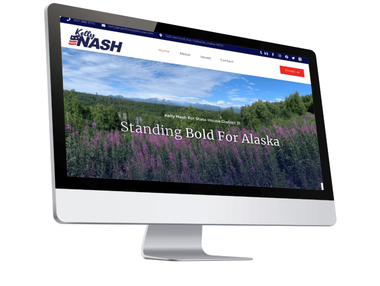
Kelly Nash contacted MPR Designs for a three-page website that would help her in her fight in Alaska for the House seat. As a grassroots candidate, Kelly’s primary objective was to create an online platform for recruiting volunteers and to amplify her voice on crucial campaign issues. Having faced a disappointing experience with a previous web designer, we were determined to transform her experience into a positive one.
Empower Your Political Campaign with MPR Designs – A Website for Kelly Nash’s Journey to the Alaska State House
Our journey began with a detailed consultation, where we meticulously explored the website’s requirements and expectations. Kelly, who had worked with websites before, arrived prepared with written content and finalized logos, providing the foundation for the initial site draft. Drawing inspiration from other websites, we gained in-depth insights into how we could maximize the potential of Kelly’s site. We discussed features she admired and how to adapt them effectively.
Kelly’s vision for the site was clear: a dominant presence of red, complemented by navy blue and gold (the colors of Alaska’s State Flag). Additionally, the website had to be user-friendly for all visitors. With this comprehensive information, we crafted a robust first draft that was delivered to Kelly within 48 hours.
Live Zoom Website Build Meeting – The Creative Evolution
In the subsequent live Zoom meeting, we collaborated closely to bring Kelly’s envisioned changes to life. We filled gaps in content, ensuring comprehensive coverage. Page by page, we delved into the intended functionality, making adjustments as per Kelly’s requests. Together, we chose and purchased a URL to host the website. (www.nashforstatehouse.com) With a clear direction and a strong feeling about the site’s structure, we moved forward, finalizing the details once the website was linked to its domain.
Live Zoom Website Meeting – Final Check before Launch
A short span was all it took to implement the final changes. In our last meeting, we reviewed and proofread every aspect of the website before the launch. Kelly received an informational packet with our suggestions for optimization. We made the necessary changes and confirmed the accuracy of the information and the design.
The latter part of the meeting was dedicated to training Kelly on administering her site, understanding visitor analytics, and managing contact forms. We provided documents with essential information for her reference. After ensuring Kelly had no further questions, we went live.

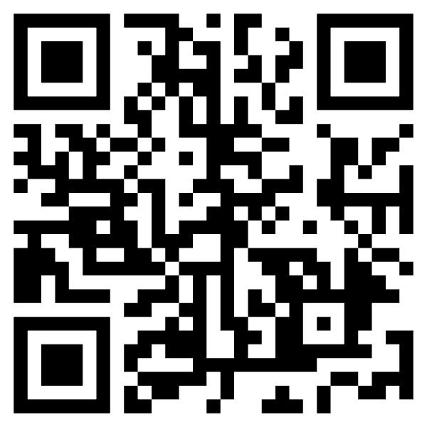
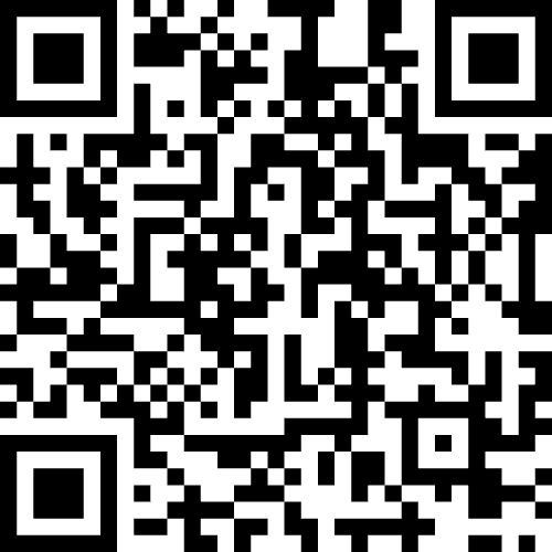
Example of QR Code Bundle Included
A Month’s Reflection:
One month post-launch, we reconnected with Kelly Nash to assess her experience and the website’s performance. Kelly expressed her goal of increasing website traffic and enhancing the site’s visibility, which were achieved in the short amount of time that the website had been live.
Our collaboration with Kelly Nash resulted in a responsive and user-friendly website, equipped with efficient email setup, live Zoom meetings, Google Analytics integration, reCAPTCHA security, and a helpful checklist for improving the site pre-launch.
